Vimla
Visual Identity
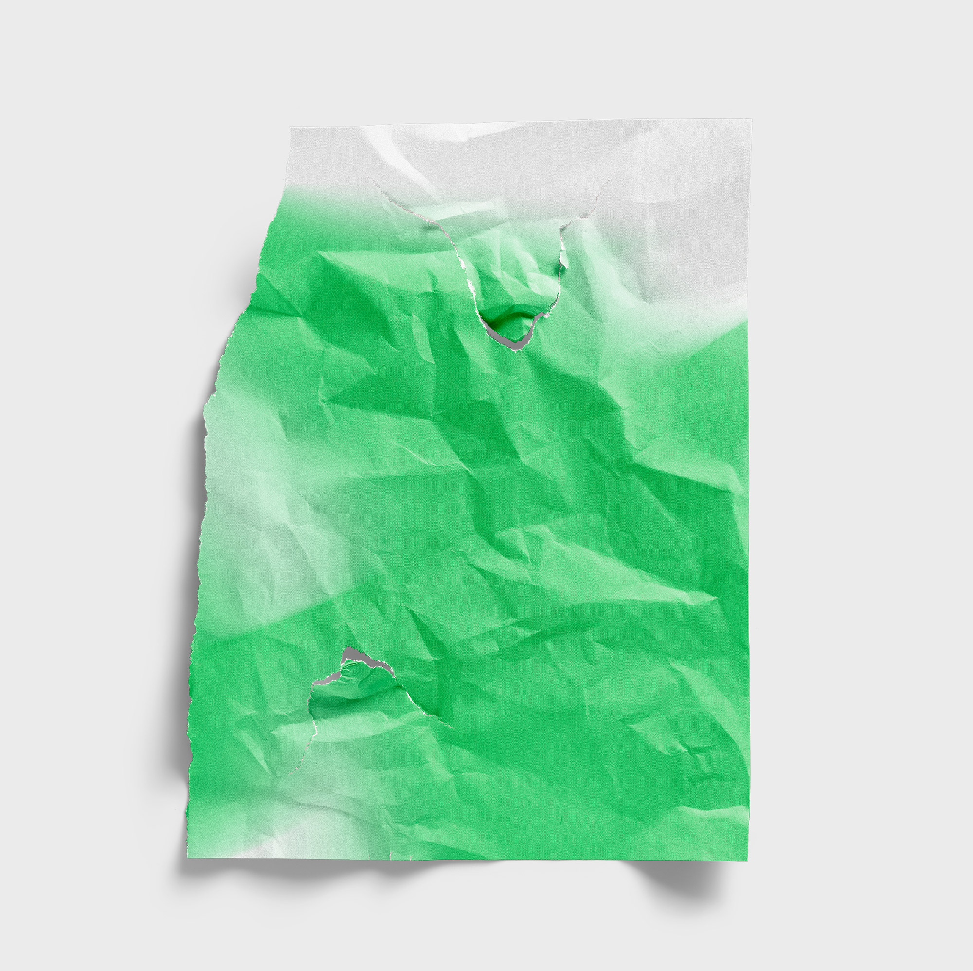
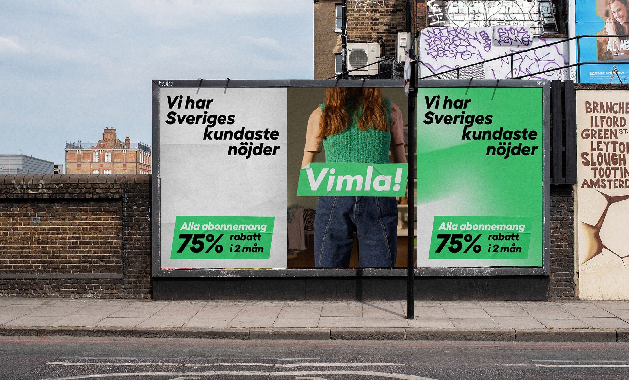
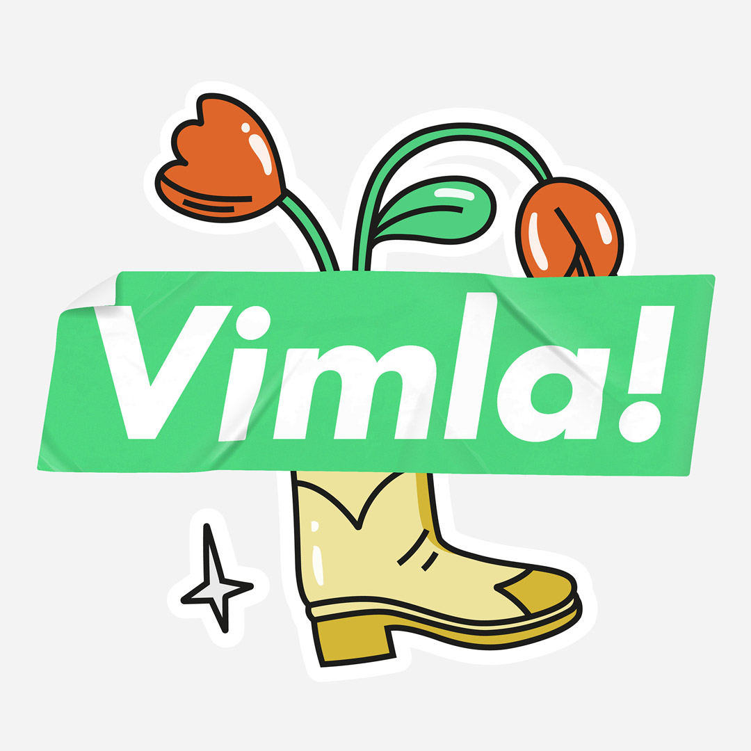
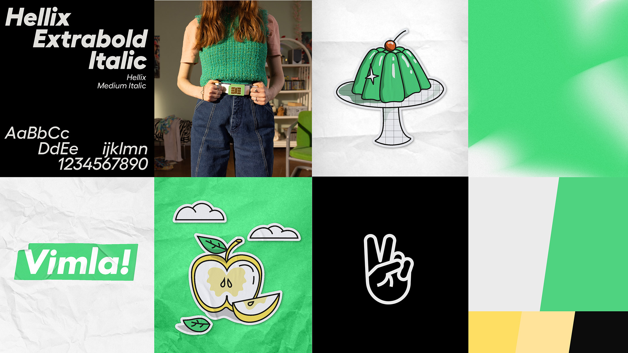
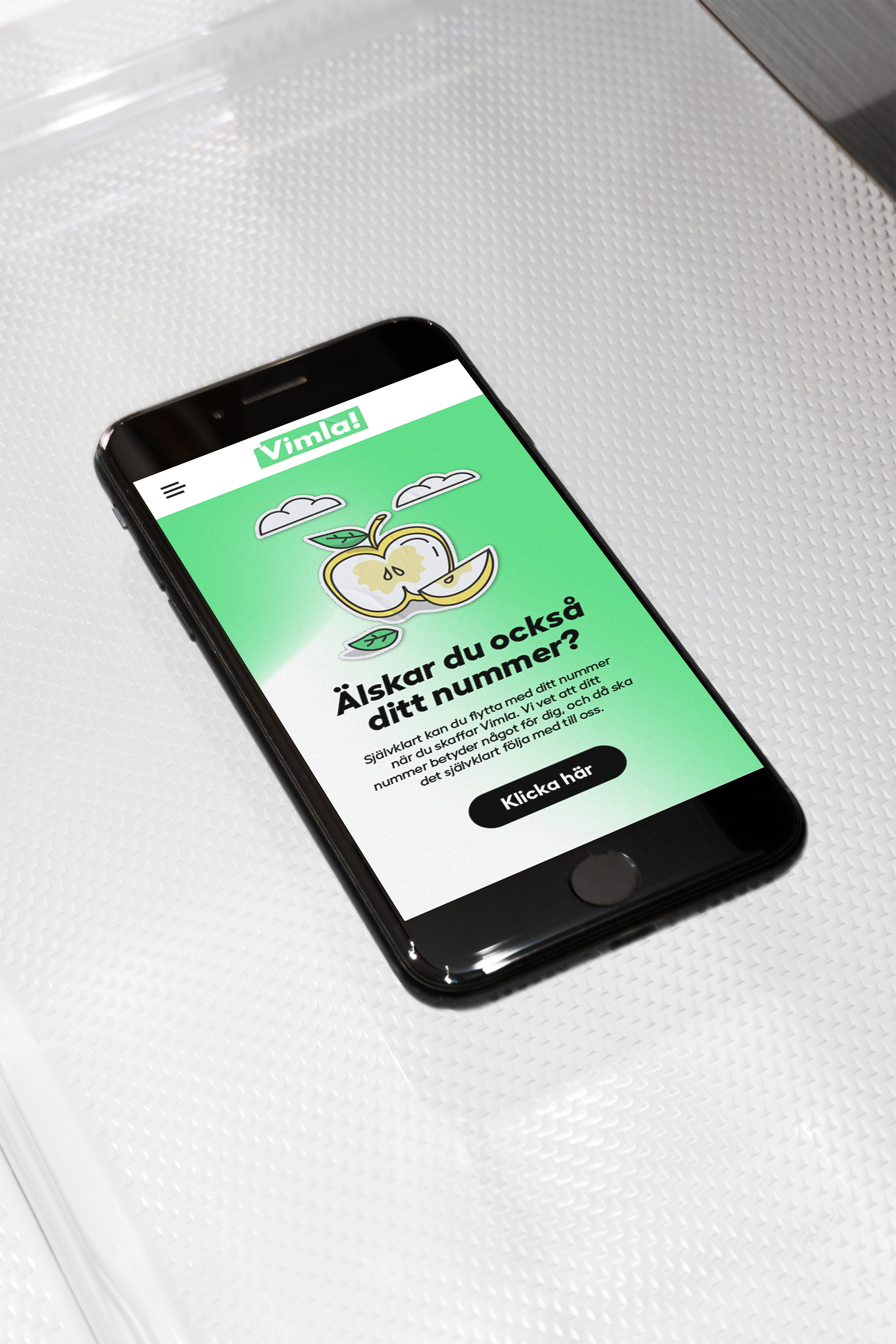
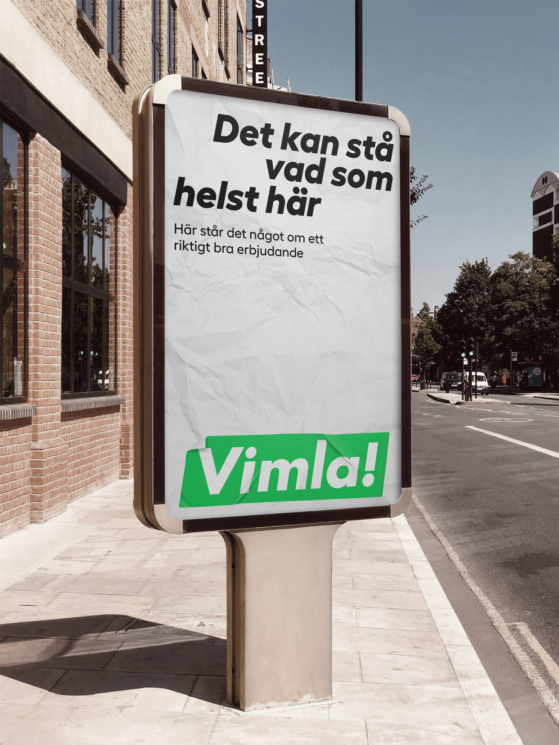
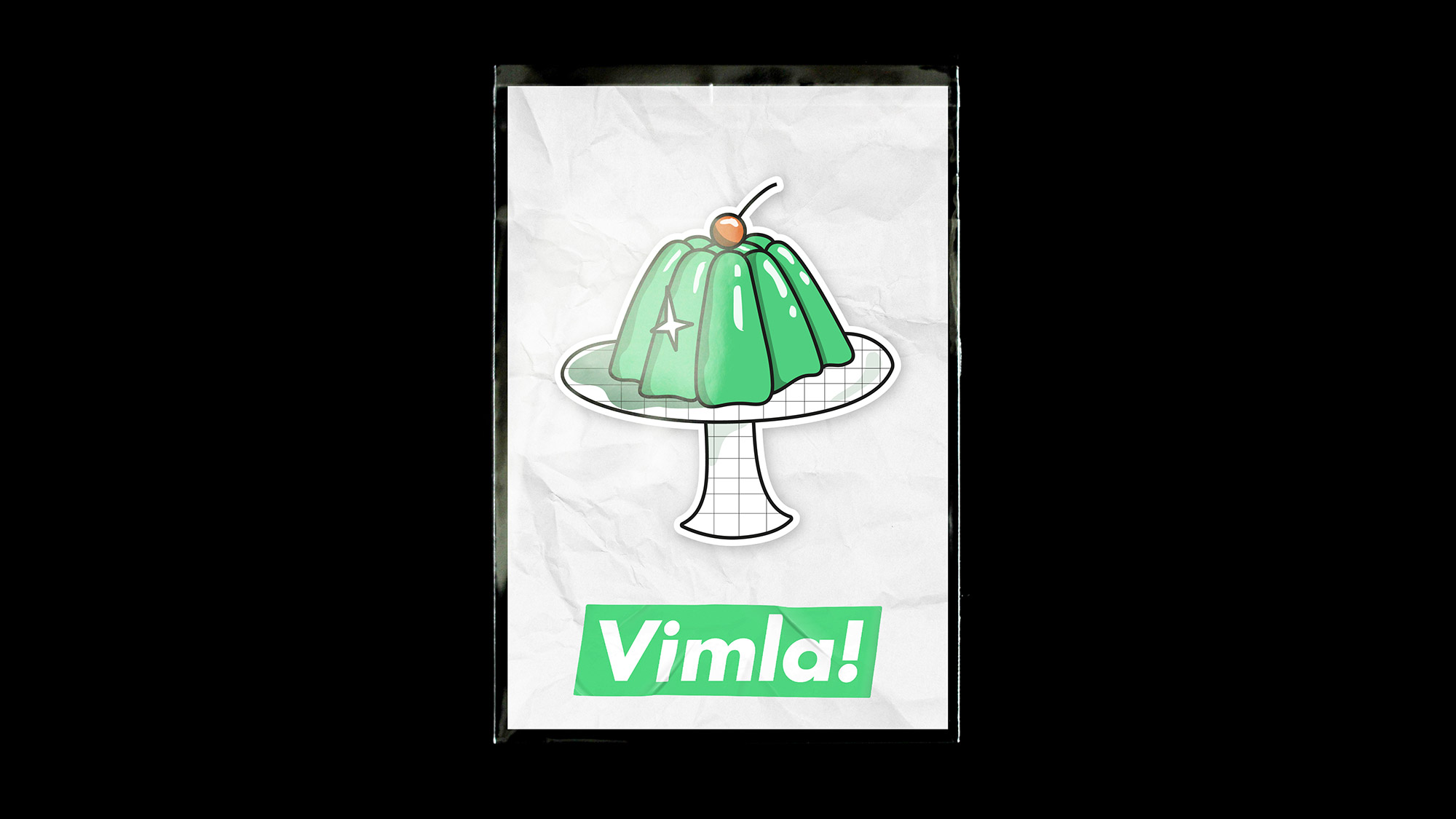
As Vimla's brand develops we have been privilieged to be a part of the continuous development of the visual identity, from color palette to visual system to illustrations. For the latest visual update for Vimla, we wanted to focus on the core of the brand that has been it's great strenght from the very beginning. Their warmt and quirky personality. For the 2024 update, we made tactile sticker versions of the logotype and pricetag, without losing its strong visual recogniction. We also hand made paper textures to go along with the tactile sensation of the logotype.
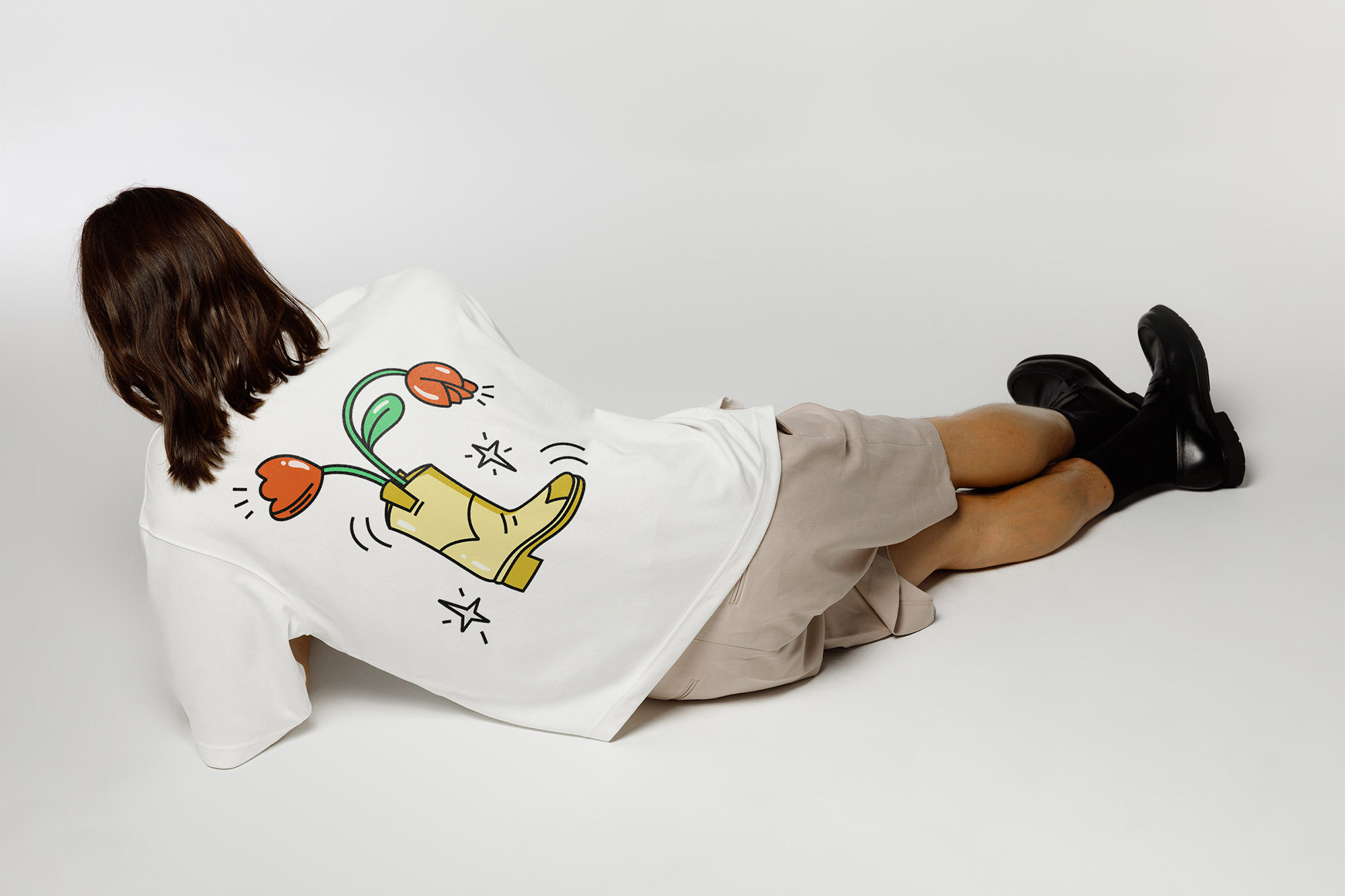
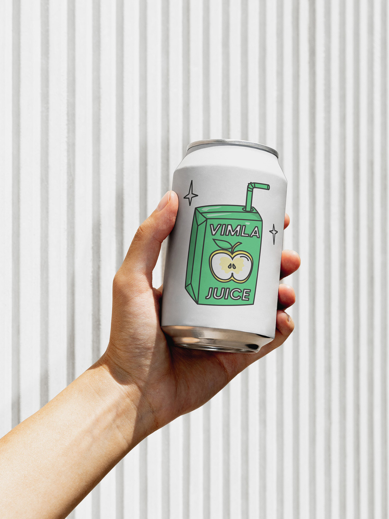
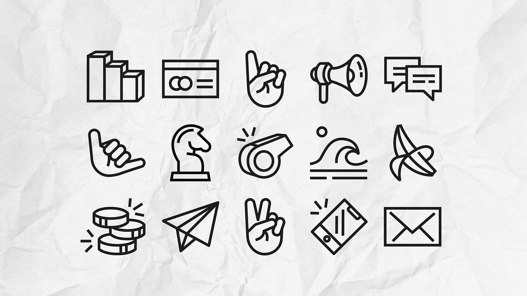
The new illustrations are grungy, bright and cheerful - and brings childish excitement to Vimlas communication.

More work
-
Västtrafik - Gå på fram
-
The Dawit Isaak Library - The Bound Books Project
-
Ramlösa - Fluent as Water
-
Eriksberg - Julpåskölen
-
Malmö Konstmuseum - Visual Identity
-
Malmö stad - SFI IRL
-
Sandvik - The Impossible Statue
-
E.ON - The Jarnys
-
RFSU/Way Out West - The Livebrator
-
Skånetrafiken - Visualizing the journeys we make together
-
Läkerol - Makes people talk
-
Samsung - Make more of every moment
