Sambla
All loans can get better
Sambla – one of Sweden’s nicest loan comparison companies – needed us to make sure that everyone got to know them better. So, we created a brand concept and a fab new look to match its ambition to become no.1 on the market – all rooted in the simple yet brilliant belief that all loans have room for improvement.
Not so great reunions
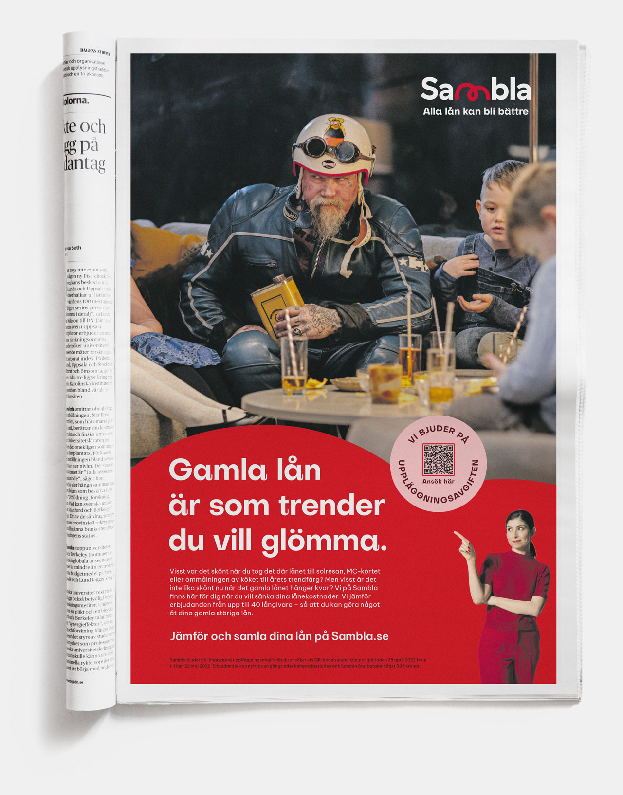
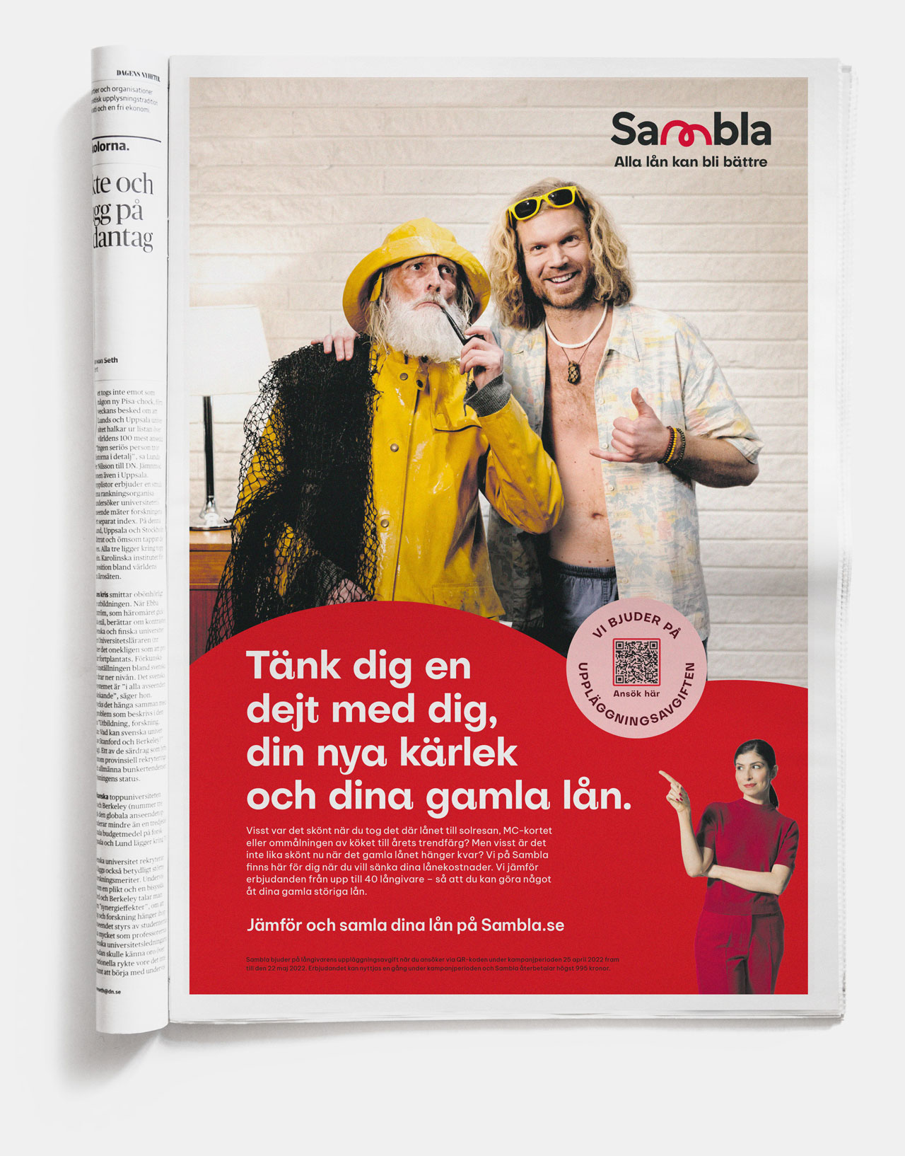
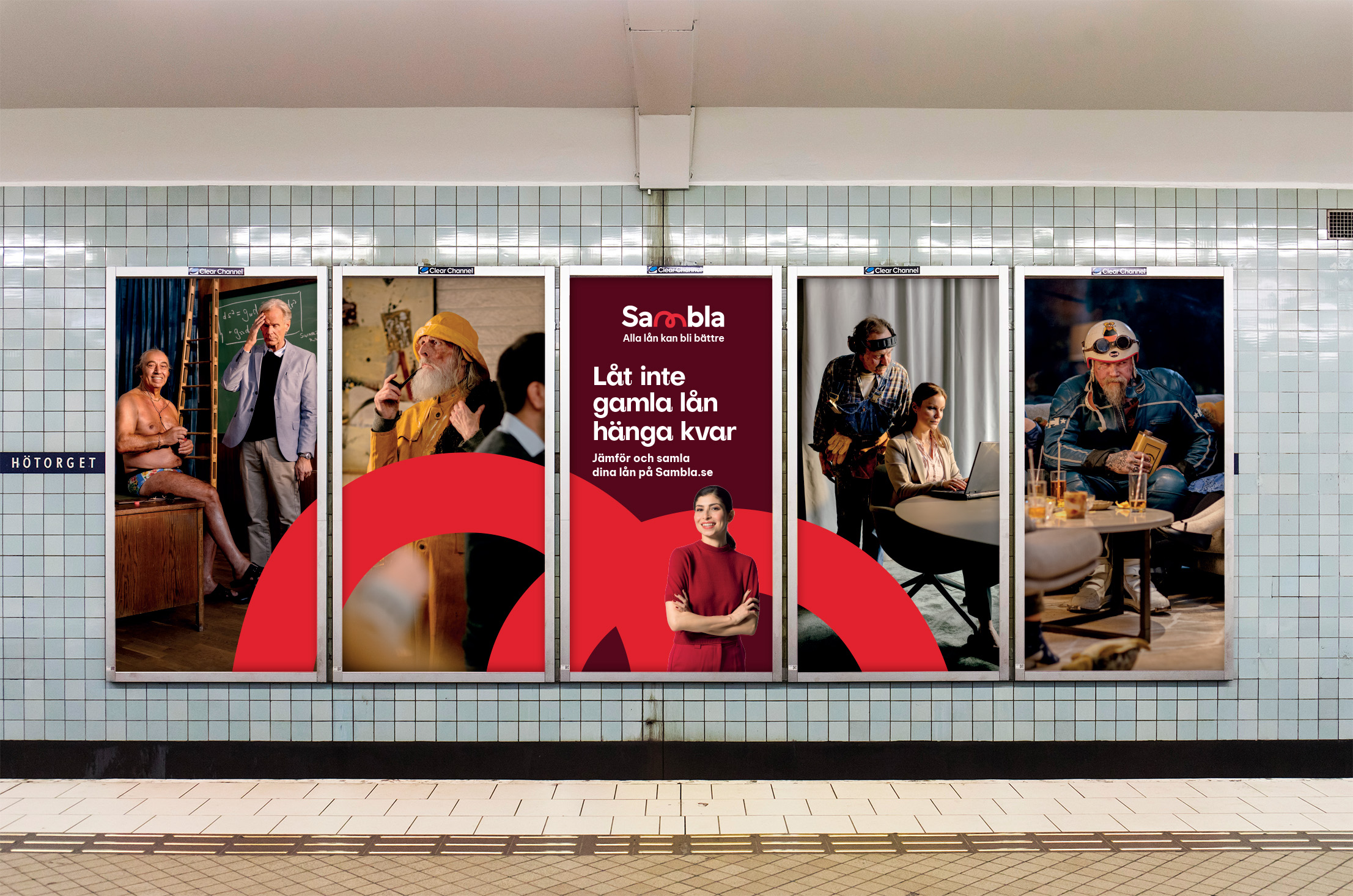
Our first campaign “All loans can get better” lets loose all the odd loans people have in their back of their minds. And as they’re brought to life we see them pestering their borrowers in what becomes as funny to the viewers as they are embarrassing to their owners.
Humour has taken Sambla to a firm no.2 spot in the market and the campaign has been a major success.You can’t argue with a good laugh.


Look the business...
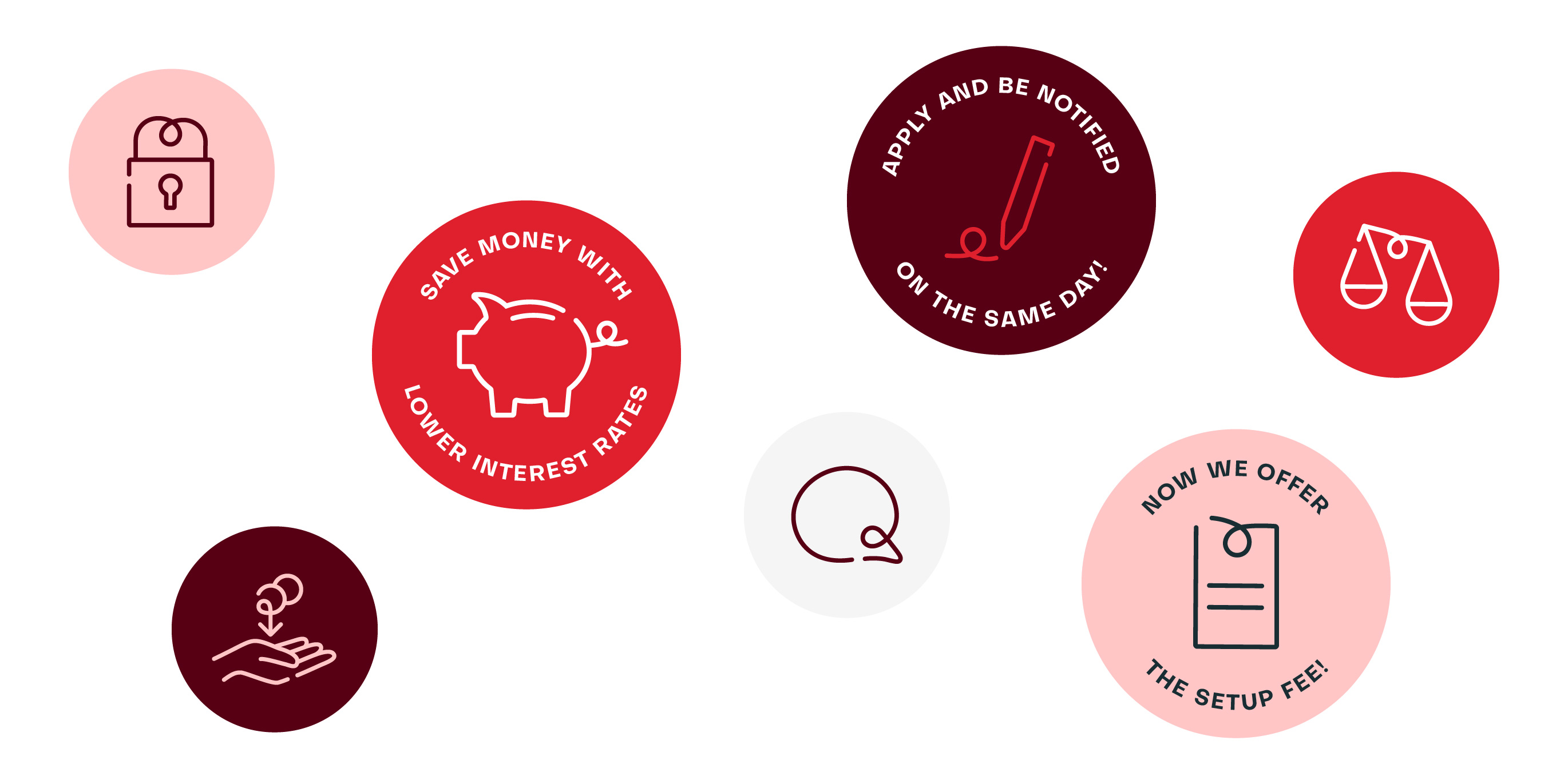
…and they will remember you. Sambla’s new graphic identity is fun, bold and sticks like Gaffa tape in every possible touchpoint.
The identity is based upon the idea of connection. Since Sambla connects everyone with the best possible loan offers and does so with great personal service the symbol defining Sambla became the quirky “m”. Bridging consumers with great offers. Together with the eye-catching red color palette the “m” forms the base for Sambla’s visual world.

More work
-
Västtrafik - Gå på fram
-
The Dawit Isaak Library - The Bound Books Project
-
Ramlösa - Fluent as Water
-
Eriksberg - Julpåskölen
-
Malmö Konstmuseum - Visual Identity
-
Malmö stad - SFI IRL
-
Sandvik - The Impossible Statue
-
E.ON - The Jarnys
-
RFSU/Way Out West - The Livebrator
-
Skånetrafiken - Visualizing the journeys we make together
-
Läkerol - Makes people talk
-
Samsung - Make more of every moment
